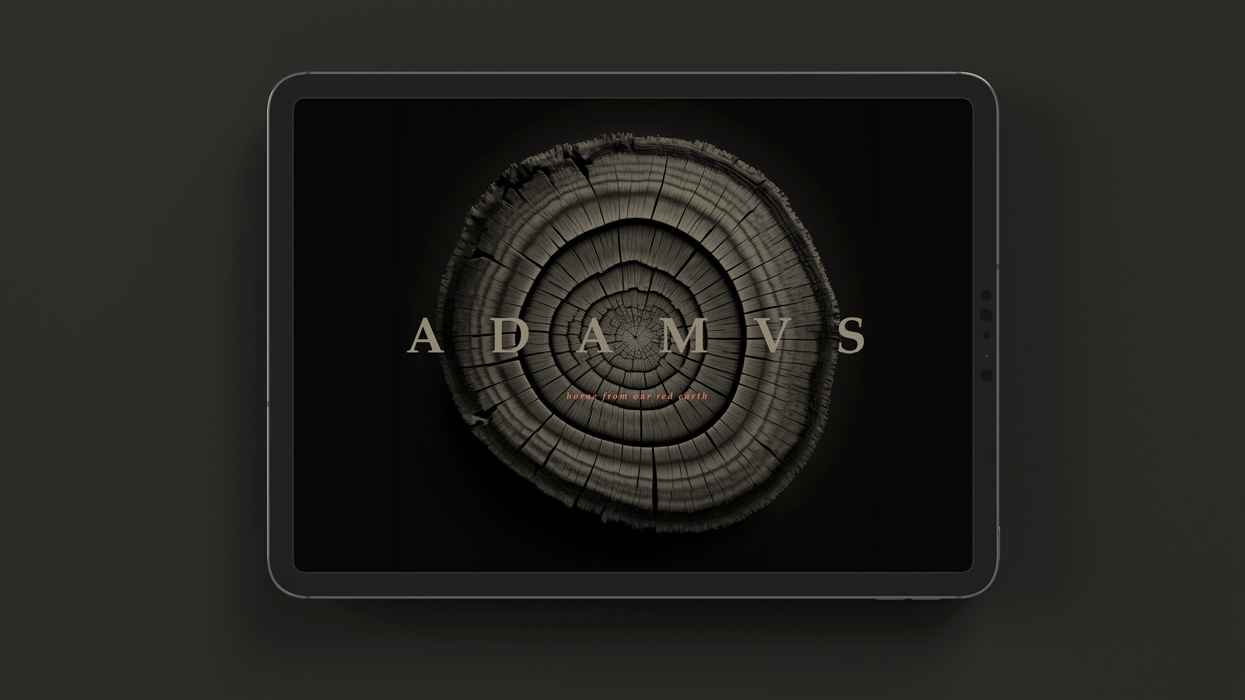
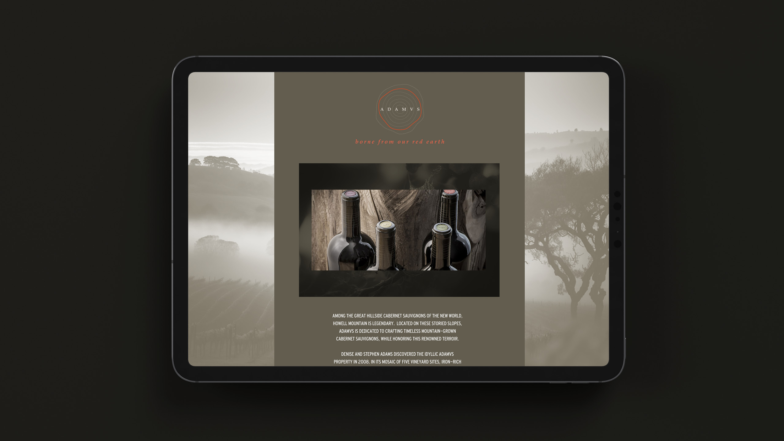
Borne from our red earth
Embracing the distinct Adamvs terroir with a dedication to excellence
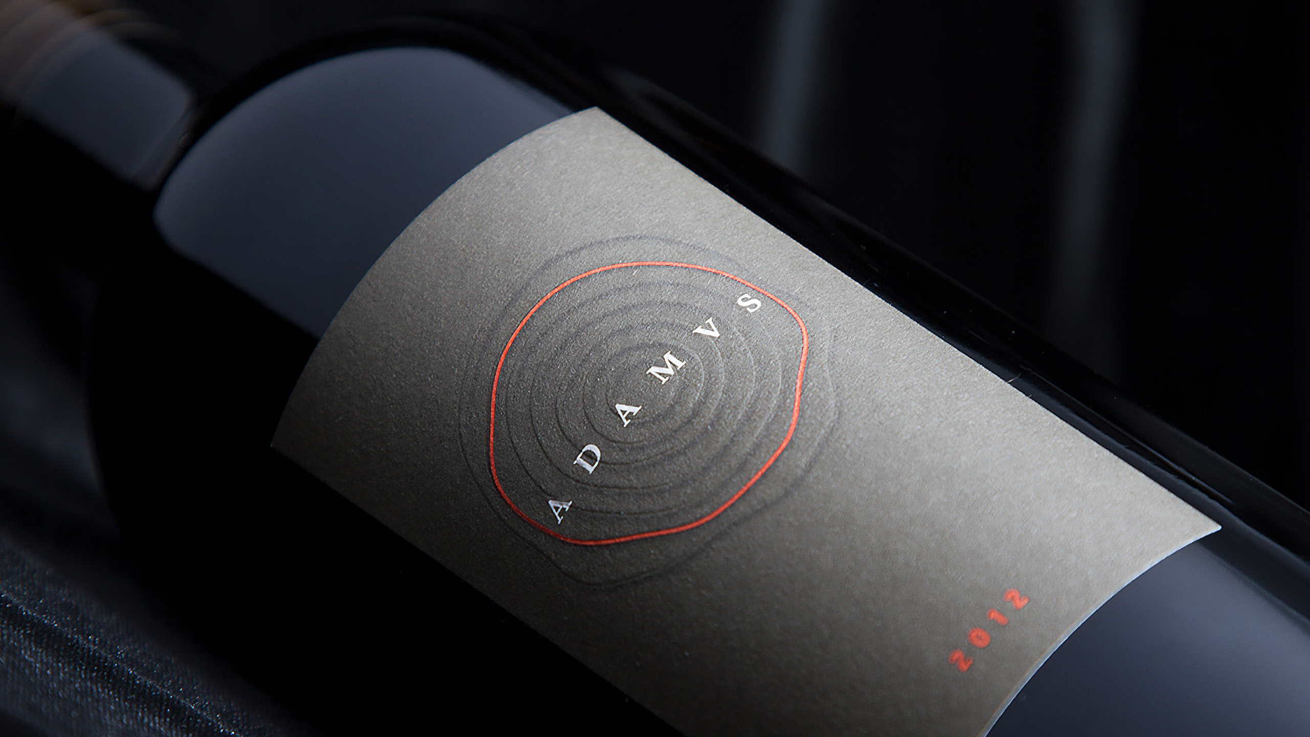
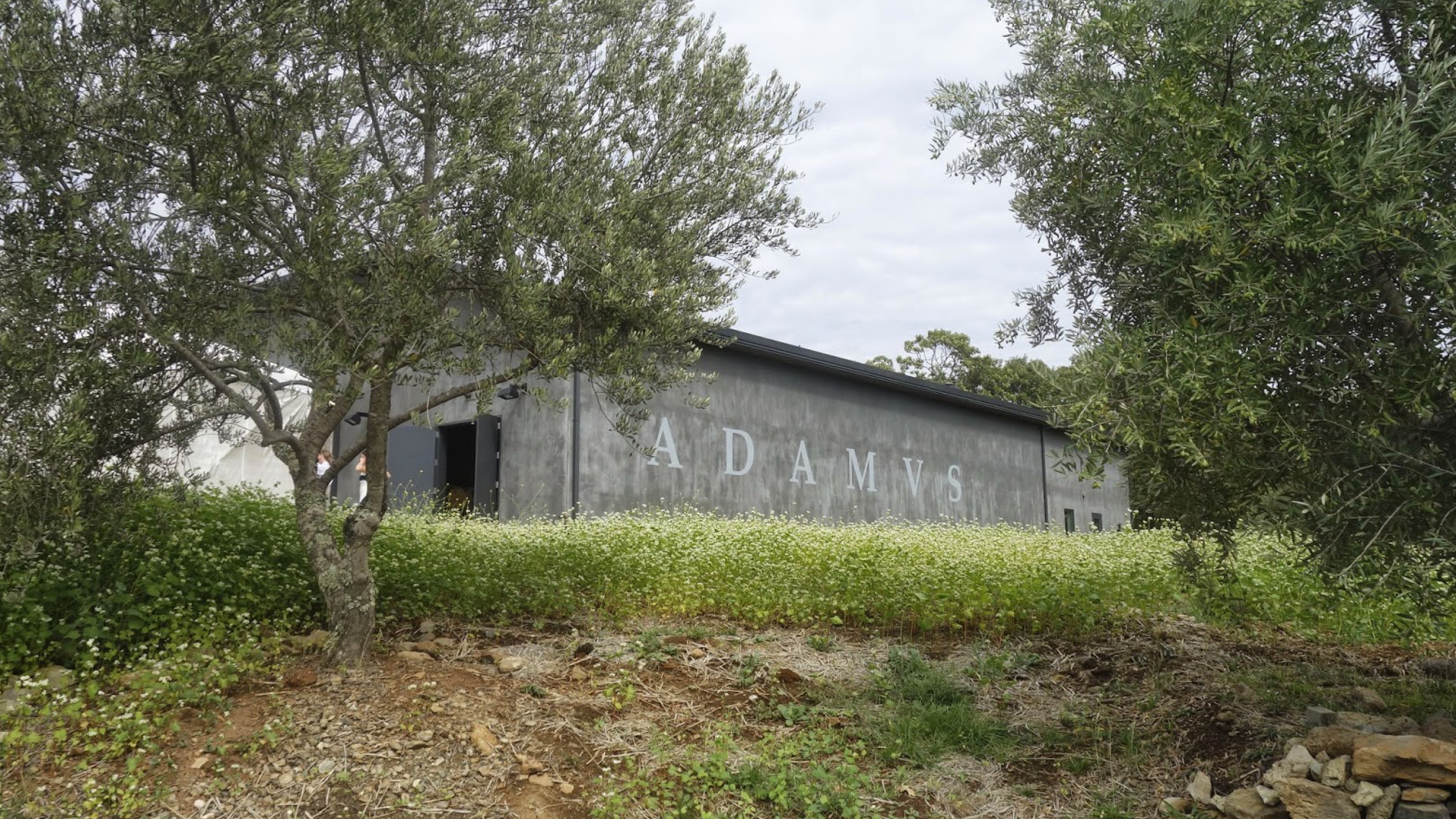
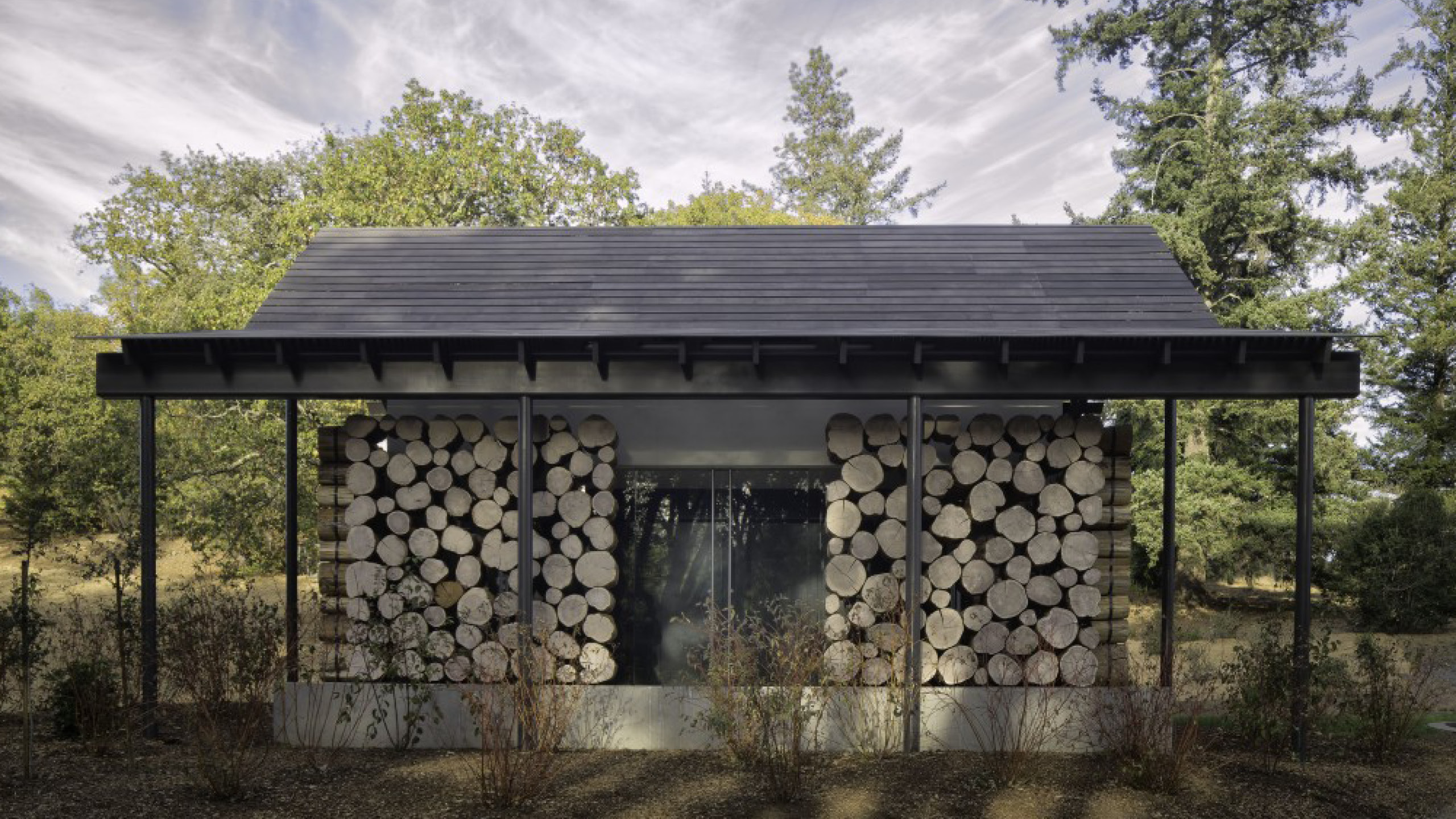
ADAMVS Winery
Borne from our Red Earth
2012
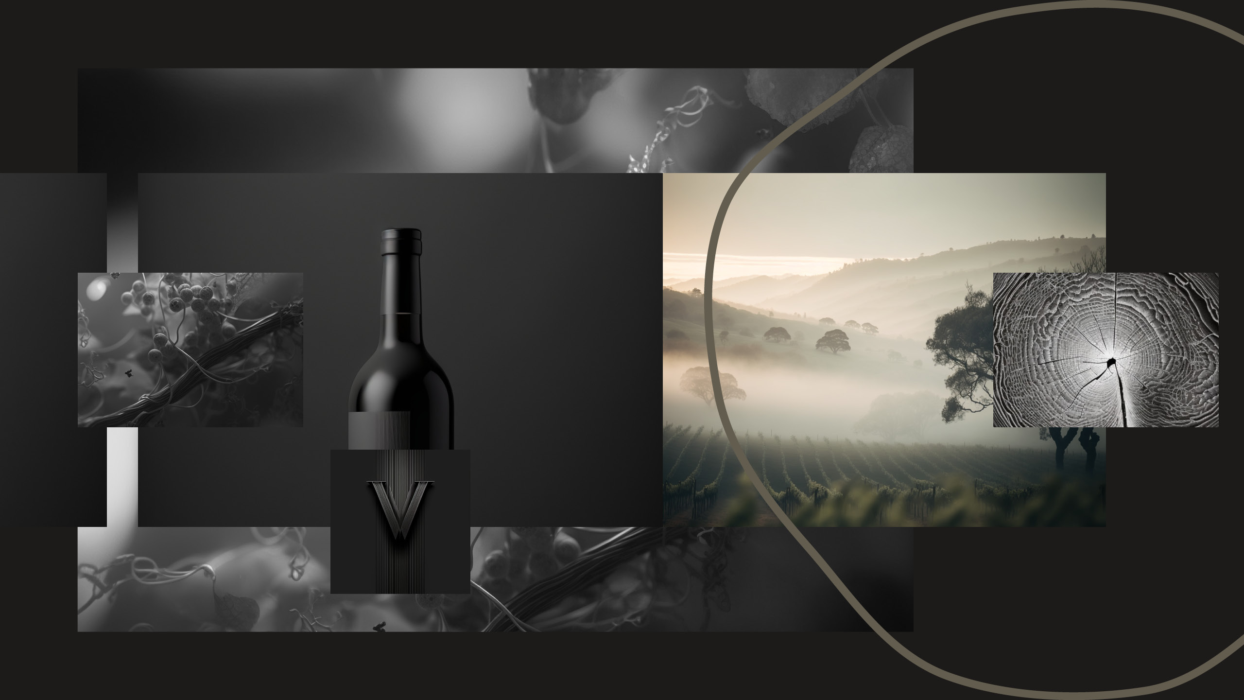
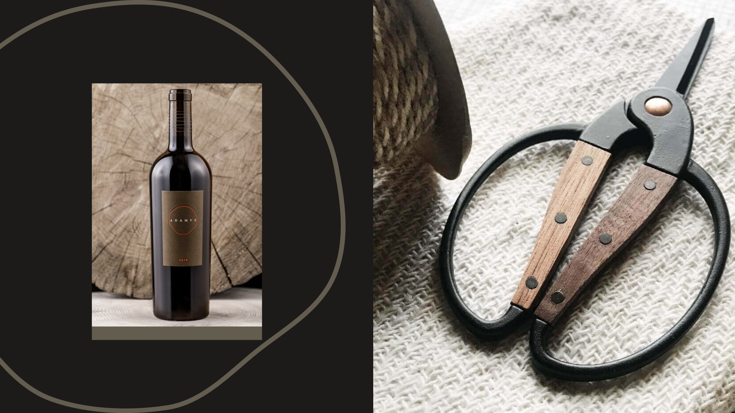
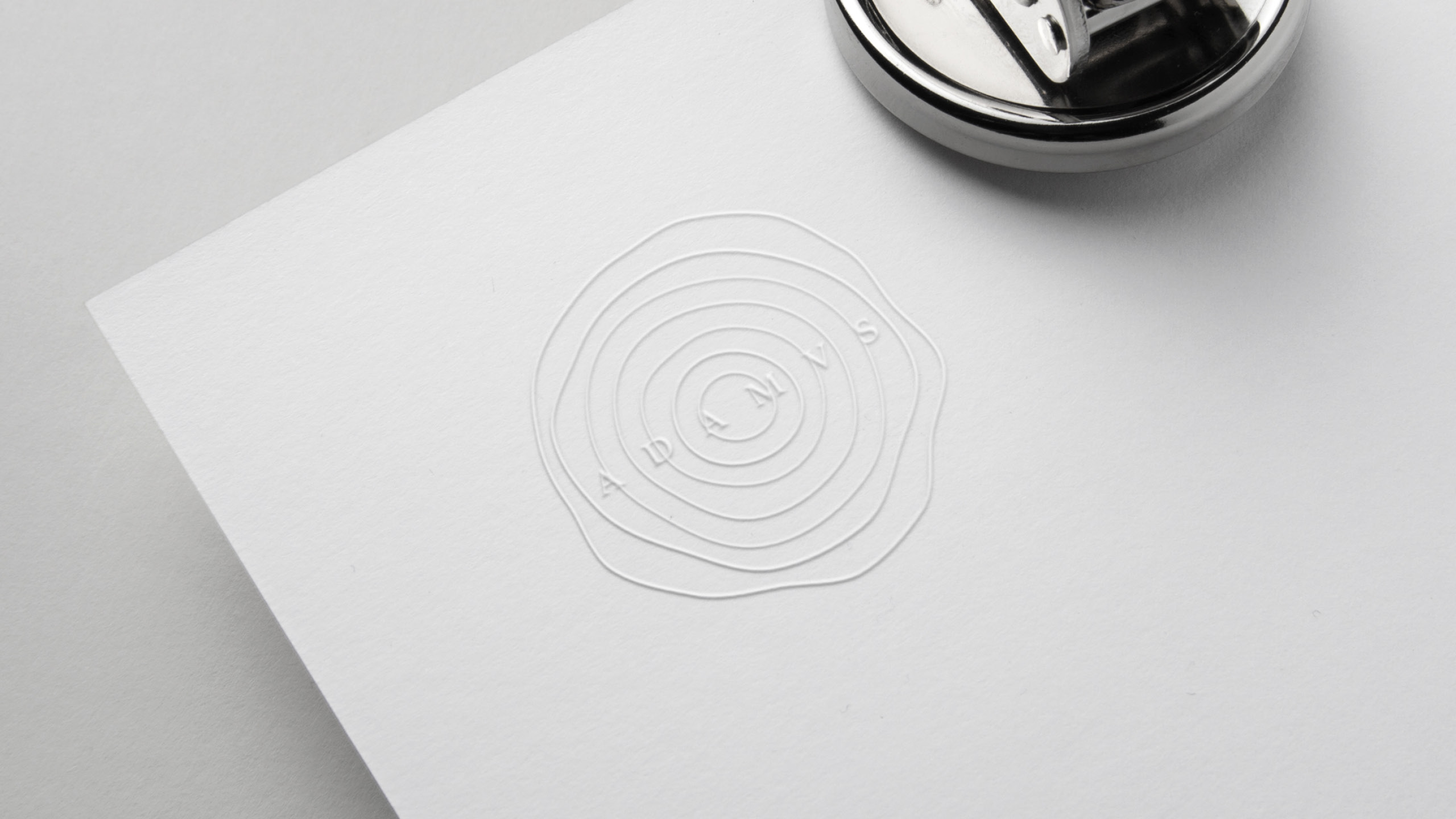
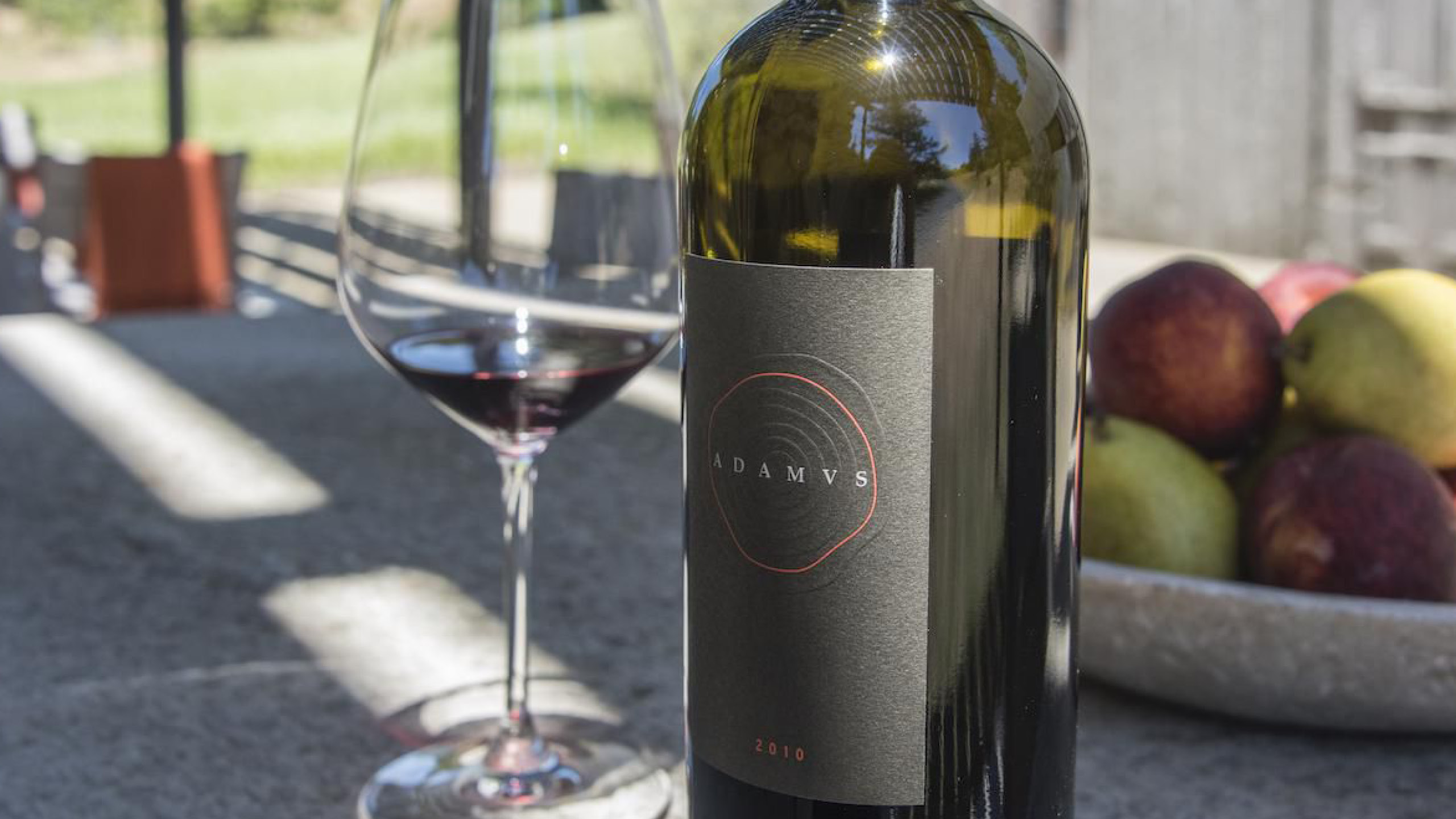
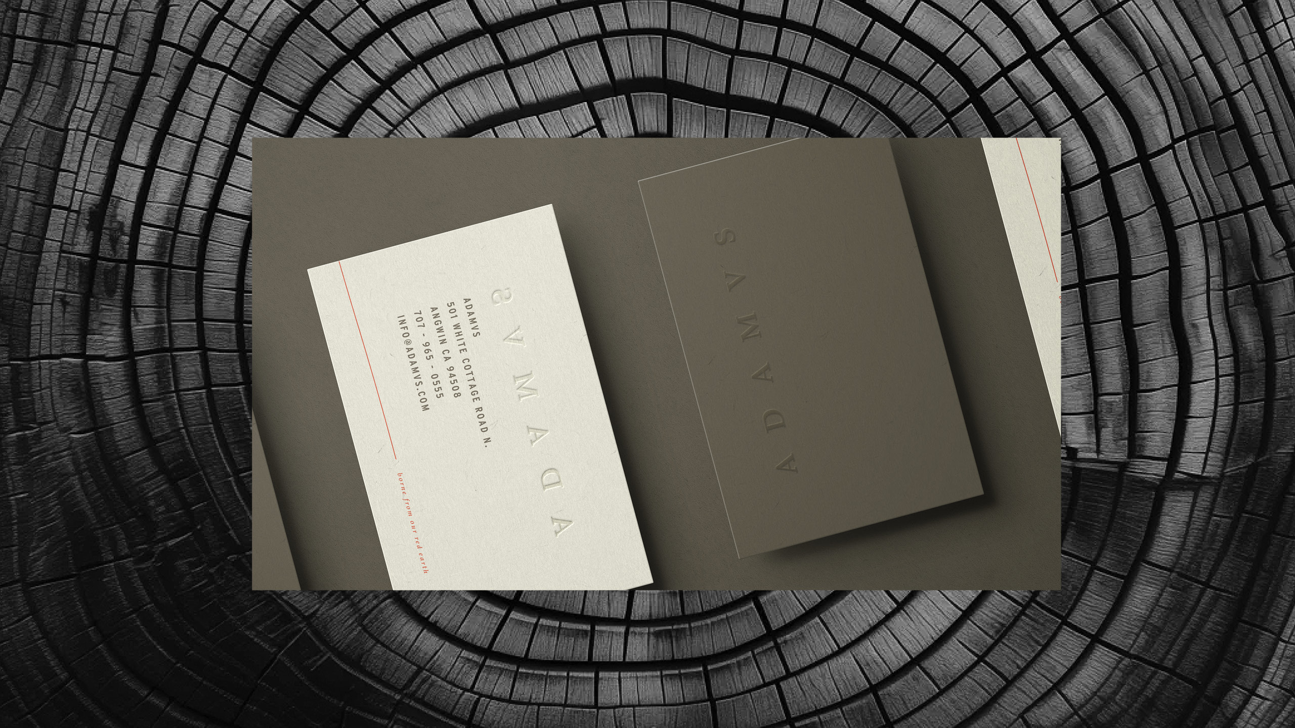
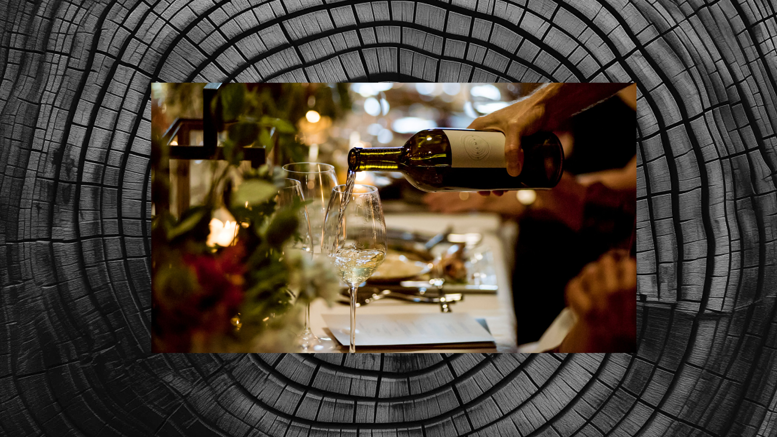
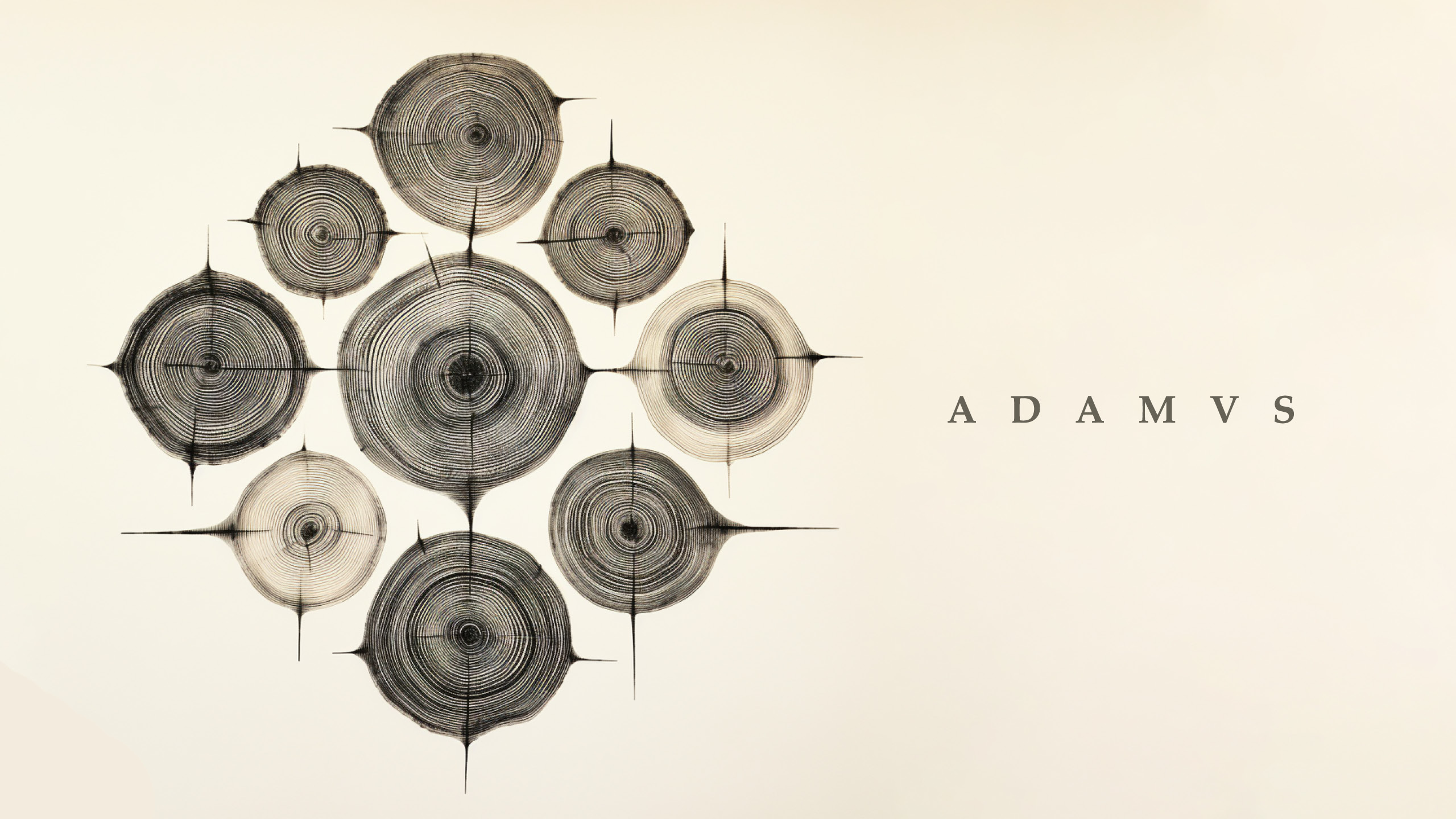
Creating the brand identity for Adamvs, a notable Napa Valley vineyard, was a comprehensive and captivating journey. Inspired by the vineyard's lush landscape and fertile red soils, we aimed to capture its unique character and story. Our approach went beyond just a logo, focusing on a visual identity that resonates with Adamvs' rich terroir and legacy.
Every design choice, from colors to typography and imagery, was carefully made to evoke the essence of the land and winemaking process. The goal was to communicate Adamvs' commitment to exceptional wines through a thoughtfully crafted visual representation.
This project became a storytelling journey through design, where each detail contributed to Adamvs' larger narrative. By blending elements inspired by the landscape and soils, the brand identity became a testament to the vineyard's character, showcasing its history and dedication to quality wines. The aim was to create a standout brand in the competitive wine industry, connecting with the audience and visually embodying Adamvs' unique terroir and commitment to excellence.
Concept & Design
UXUS Amsterdam
Direction - George Gottl
Photography: Adamvs, UXUS AMS
More information:
